Most of the new brands being launched today are created to serve an existing market leader rather than to create new markets. That is why you get so many me-too products out there in the market place today.
li9ht Brand Communications is not against market research. In fact, we do a lot of market research in the course of our work but market research alone will not help you create the next big brand. Market research can only tell you the size of an existing market and what customers have bought (or not bought). It cannot help you to create a new market. If you cannot create a new market for your brand, your brand cannot grow.
The reason is very simple. If you launch a brand that is designed to serve an existing market, that market will already have been dominated by some big players and a lot of smaller ones. It is tough launching a brand into a market that already has so many battle-hardened competitors.(y)

This is the official blog of LI9HT BRAND COMMUNICATIONS, managed by PT Asta Nindya in Jakarta, Indonesia. This blog displays the WORK, IDEAS and PEOPLE who toil in a young company with small staff and a big sense of humor.
Selasa, 26 Maret 2013
Selasa, 19 Maret 2013
Unfolding the Truth About Beer


Beer
is the best damn drink in the world, yet not everybody what it is. Some of us
at li9ht Brand Communications had ever drink a pint, but all of us didn’t even
know what beer really was when PT Multi Bintang Indonesia Tbk. (MBI), the
producer of Bir Bintang, Heineken, Bintang Zero, Green Sands and Recharge
presented us the opportunity to get a hand at their beer products by conceiving
and designing a distinctive booklet that unfolded the truth about beer. The
booklet will be handed over to people coming to MBI’s breweries for a so-called
“brewery visit”.
After
hours of intense brainstormings among ourselves and with the client and one
time brewery visit to the company’s one of two plants in Tangerang (the other
being in Mojokerto, East Java), li9ht’s creative team came up with an
out-of-the-box booklet design concept that represented the MBI’s spirit—enjoyment.
The content discloses facts about beer that we assumed most people don’t know
about. The booklet takes the form of a big glass tankard full of beer and foam
with the Heineken and Bir Bintang logos on the body of the glasses. This is to
tell the audience what to find “what is inside a glass of beer”.
CLIENT:
PT Multi Bintang Indonesia Tbk.
PROJECT:
Beer Booklet
CREATIVE
DIRECTOR: Anto Dwiastoro
COPYWRITER:
Anto Dwiastoro
Senin, 18 Maret 2013
A Dashboard Pad to Hold Two Tires


Bridgestone
tires’ users are car owners, and car owners love to display functional trinkets
all around the inside of their cars. That was why Bridgestone promoted a rubber
dashboard pad that can hold coins, a cellphone, or any other small items that
are easily lost, for a purchase of two tires.
There
is nothing special with a square dashboard pad with the Bridgestone logo
printed on it, so li9ht Brand Communications’ creative team created a distinctive
print ad and store banner to make it, at least, look special. We did an ad with
a classic shade simply to give the impression that Bridgestone tires have been
long in the market. A straight headline that says “Buy 2 Bridgestone Tires and
Get a Dashboard Pad for Free”, and straight visual. Our consideration was that
the message must be direct without bluff.
CLIENT:
PT Bridgestone Tire Indonesia
PROJECT:
Print Ad and Store Banner for Sales Promotion
CREATIVE
DIRECTOR: Anto Dwiastoro
COPYWRITER:
Anto Dwiastoro
Rolling A Drink Bottle with Two Tires
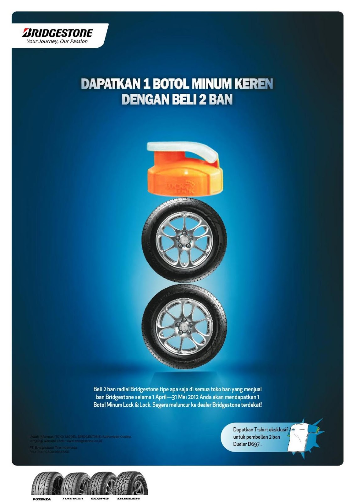

We
know by research that consumers want more than simply a product that marketers
are selling to them. To keep them loyal to a particular brand, a particular
marketer will launch sales promotion programs, either by price deals, loyal
reward programs, sweepstakes or any other deals. To pull more consumers to buy
Bridgestone tires, the Indonesian marketing office of the Japanese tire brand
implemented a loyalty reward program, where consumers will get a Lock &
Lock drink bottle for the purchase of two tires.
PT Bridgstone
Tire Indonesia invited li9ht Brand Communications to work on the print ad and the
store banner that promoted the program. The headline went straight: “Get 1 Cool
Drink Bottle By Buying Two Tires”. But li9ht’s creative team went cutting-edge
and produced a bent visual, where the two tires were shrunk and formed as if
they were the bottle itself with the real cap on top.
CLIENT:
PT Bridgestone Tire Indonesia
PROJECT:
Print Ad and Store Banner
CREATIVE
DIRECTOR: Anto Dwiastoro
COPYWRITER:
Anto Dwiastoro
How to Excavate More Money


Being
a member of Trakindo Group of Companies, PT Chandra Sakti Utama Leasing (CSUL)
provides its customers the convenience and benefit of having all of their
leasing needs under one roof for the purchase of Caterpillar equipment. The company
delivers a one-stop financing for the purchase of Caterpillar tractors,
loaders, engines, generators, excavators and more, for the construction,
mining, forestry, agricultural and energy sectors. Not all prospective
customers of CSUL’s parent company, Trakindo, are aware of this freshen service,
thus li9ht Brand Communications was called in to conceive and design its
marketing kit.
The big
idea was very simple. The Caterpillar equipment that customers buy are sometimes
utilized for the “digging and dredging” of mining materials that were not known
before, so we came up with a single keyword that may represent them all: “unearth”
or “excavate”. By digging into CSUL’s,
Trakindo’s customers may find the best financial solutions ever offered to them,
which eventually will make their businesses more profitable.
CLIENT:
PT Chandra Sakti Utama Leasing
PROJECT:
Corporate Brochure
CREATIVE
DIRECTOR: Anto Dwiastoro
COPYWRITER:
Anto Dwiastoro
Bridgestone’s Chamois Story


There
is nothing too special about a chamois
leather cloth: A type of porous leather that is favored for its gentle,
non-abrasive composition and absorption properties. Car and motorcycle owners
have chamois cloth in their inventory as automotive drying material that is
safe on acrylic, lacquer, enamel, and polyurethane paints and clear-coats. For this
reason, Bridgestone deemed the chamois leather a suitable free gift in exchange
with the purchase of two Bridgestone tires.
For this,
Bridgestone hired li9ht Brand Communications to develop concepts for magazine
and newspaper print ads and store banners that advertised the sales promotional
program. We explored several car owners in Jakarta to find out what they used a
chamois leather cloth for, and whether the cloth is worth to get for two
not-cheap Bridgestone-branded tires. Well, what do you know, other than to
wipe dew or water off their car body, a chamois leather is also used to clean
up the dirt that sticks to car windows! These facts became the creative
rationale of the above designs.
CLIENT:
PT Bridgestone Tire Indonesia
PROJECT:
Print Ad and Store Banner for Sales Promotion Program
CREATIVE
DIRECTOR: Anto Dwiastoro
COPYWRITER:
Anto Dwiastoro
Rabu, 13 Maret 2013
A Colorful Plastic Surgery

What
is more to say about plastic products? Now, here is a plastic product
manufacturing company, based in Sentul, Bogor, West Java that wanted to have an
image finer than its bigger, more popular competitors, while keeping its size
small. PT Arkan Indoplast Utama manufactures plastic packaging and other
products through blowing as well as injection moulds. Well known brands of
shampoos, lubrication, motorcycles, and electronics entrust their packaging and
parts to Arkan, while the company, realizing the waste may damage the
environment, practices the best approach to occupational health, safety, and
environment. There is more to plastics than mere manufacture, so li9ht Brand
Communications saw the need for Arkan to undergo a plastic surgery to produce
an image that has a finer quality.
The identity
development took the form of designing a new logo and improving the looks of
the company profile. The logo moved off from the chemical symbol of plastic
with the color green to signify Arkan’s care for the environment. It bears the
slogan “Beyond Plastics” to affirm the company’s undertaking that goes further
than manufacturing plastic products.
The three-fold
company profile design reveals a colorful display of products, people,
technologies and accents that will be perceived as being a modern and dynamic
company with an eye to the future.
CLIENT:
PT Arkan Indoplast Utama
PROJECT:
Corporate Identity Development
CREATIVE
DIRECTOR: Anto Dwiastoro
COPYWRITER:
Anto Dwiastoro
Taking A Coal Mining Contractor to the Next Level

The
Jakarta-based PT Putra Perkasa Abadi or PPA Coal ventures in the field of coal
mining as a contractor. It summoned li9ht Brand Communications’ assistance in
developing the company’s visual and verbal identities. Environmental issues have
been emerging lately, so we recommended the client to pick it as the central
theme. Coal mining has been blamed for environmental damage, so it will be wise
to brand PPA Coal as a coal mining contractor that cares for the conservation
of the environment. The logo design started off as a stylized form of a coal
(represented by the light to dark grey cube) which is overwhelmed by a bigger light
green cube that represents the green and clean environment. The entire design
connotes that PPA Coal applies a green operation of coal mining.
The kind of typography that we selected for the name of the company gives the impression of being playful so as to make it perceived as a "user-friendly" service company.
The kind of typography that we selected for the name of the company gives the impression of being playful so as to make it perceived as a "user-friendly" service company.
The
slogan at the bottom literally signifies that
customers will be taken into deeper levels of the soil, where the best quality
coals are usually found, and it is also an idiom which means “to improve”. In
other words, PPA Coal improves the way coal mining is done and it will improve a
customer’s coal trade.
CLIENT:
PT Putra Perkasa Abadi
PROJECT:
Visual and Verbal Identity Development
CREATIVE
DIRECTOR: Anto Dwiastoro
COPYWRITER:
Anto Dwiastoro
Selasa, 12 Maret 2013
The Intellectual and Spiritual Wisdom’s Need for Branding


Folder (Outside)

Folder (Inside)

Flap
The Sumohadiwidjojo
Center was founded in December 24, 2011 in Jakarta to promote the study of intellectual
and spiritual wisdom for the wellbeing of man and the world. The center
submitted a request to li9ht Brand Communications to develop its visual
identity and its application on numerous promotional items that were used in a
seminar on the subject on June 9, 2012. The logo design started out from the
Center’s name initials, i.e. SC. The body of the “S” is shaped by the stylized
form of a quill, and the “C” finds itself inside the “S”, which symbolizes that
it is the core of the Center’s activity—a study center. The color blue stands
for “peace” and “spirituality”, grey for neutrality and yellow being the color
of the mind and the intellect.
CLIENT:
Sumohadiwidjojo Center
PROJECT:
Identity Development
CREATIVE
DIRECTOR: Anto Dwiastoro
Upgrading the Looks
PT
Bridgestone Tire Indonesia wanted its TOMO (Toko Model—brandname for the
company’s tire and accessories store chain) print advertising to have a new
look. It was not ingenuously new in terms of visuals and copywriting; li9ht
Brand Communications gave the print advertising instead an entirely new soul! On that
basis, we came up with different alternatives that all represent the new soul.

Alternative
#1—the main visual becomes the headline. It shows a compass with the needle
formed by the typographic logos of Bridgestone’s tire brands—Dueler, Ecopia,
Turanza and Potenza—pointing solely at the TOMO model. It represents the
message to consumers that Bridgestone tire brands are only found at TOMO.

Alternative #2 visualizes the sketches of four
different cars with question marks being in the place of where the tires should
be instead. We intentionally used sketches so as not to identify the cars with
specific brands. Again, the visual becomes the headline of this ad, with the
bodycopy telling readers to find the answers to the question marks at TOMO, the
store that provides all types of Bridgestone tires.

Alternative #3 is totally different from the other
alternatives, with a traditional editorial layout, but has an entirely new look
compared with previous TOMO print ads, dubbed as “old look” by our client. It
was this one the got the client’s approval for the launch of the new look, while the other two were published subsequently in a row as reminders. The headline in Bahasa Indonesia says: "Choosing the Right Tire Starts From Choosing the Right Tire Shop."
CLIENT: PT Bridgestone Tire Indonesia
BRAND: Toko Model (TOMO)
PROJECT: Print Advertising
CREATIVE DIRECTOR: Anto Dwiastoro
COPYWRITER: Anto Dwiastoro
Beautified Branding

An
anti-aging and aesthetics clinic located in Cianjur, West Java, which was
started by a dermatologist invited li9ht Brand Communications to design its
visual and verbal identities. We came up with the name first, which is QSHANTIQ,
derived from the dermatologist’s name, Dr. Kishanti. The Qs in the name stand
for “quality”, while “shantiq” is a stylized form of “cantik”, Indonesian for “beautiful”. The logo uses typography and a
logogram which characterizes a woman’s head with a beautiful outlook.
The
concept for the visual identity departed from the idea that what makes one
beautiful is essentially one’s inner self, and QSHANTIQ helps its customers to reveal
that essence. Hence the headline in Bahasa Indonesia that says: “Discover the Essence of Your
Beauty”. Elements of green plants were added to give the impression that the
cosmetics and medicines used are entirely natural.
CLIENT: Dr. Kishanti
BRAND: QSHANTIQ
PROJECT: Visual and Verbal Identity Development
CREATIVE DIRECTOR: Anto Dwiastoro
COPYWRITER: Anto Dwiastoro
In Line with the Need for Logistic Professionals

The TELKOM
School of Technology (STT Telkom) in Bandung, West Java embraced the Center of
Logistic Studies of Widyatama University, also in Bandung, in starting an
educational institute that aims on meeting the need for logistic professionals.
They reached li9ht Brand Communications to develop the institute’s visual and
verbal identities.
We
started by creating a name that went well with the institute’s aim. Our
copywriter came up with the keyword “in line with the need for logistic
professionals” which later became the foundation for the formulation of the
brandname, i.e. INLINE, short for “INstitut
Logistik IdoNEsia”. Remarkably, the acronym also fits with the English
translation of it: INdonesia Logistics INstitutE. Our designer poured the
concept into a visual identity—logo—that plainly represents the subject taught
by the institute, which is “logistics”, thus visualizing the stylized form of a
man pulling a freight cart, which is in itself the stylized form of the
brandname.
CLIENT: STT Telkom and Universitas Widyatama
PROJECT: Corporate Identity Development
BRAND: INLINE
CREATIVE DIRECTOR: Anto Dwiastoro
COPYWRITER: Anto Dwiastoro
Sailing Towards the Market


The Kuala
Lumpur, Malaysia-based originally Indonesian VIER Group of Companies assigned the
branding of its three subsidiaries to li9ht Brand Communications for our broad
insight on ships and shipping and, of course, brand communication. Vierlines,
Vier Cruisers, and Sunseeker Indonesia offer the rental of service vessels for
the global oil and gas service industry, feeder container, luxury yacht charter
and sale of Sunseeker luxury yachts.
li9ht’s
creative team unpretentiously visualize the combination of ship technologies
and luxury living of the customers on the marketing collaterals VIER Group ordered
the concepting and designing to. A study implemented on prospective customers
revealed that they are the kind of people who are focused, pay attention to
detail, straightforward and love minimalistic design. We translated these in
the designs displayed above.
CLIENT: VIER Group of Companies
PROJECT: Company Profile and Corporate Identity Development
BRANDS: VierLines, Vier Cruisers, Sunseeker Indonesia
CREATIVE DIRECTOR: Anto Dwiastoro
COPYWRITER: Anto Dwiastoro
A Bridge Too Long

A
city branding project came in, and li9ht’s creative team immediately worked on
it without despair, because we all fancy the city. It was for Surabaya, the capital of
the East Java province in Indonesia, and the republic’s second largest city. Surabaya is an all-you-can-see and all-you-can-get place, also the largest “open air
museum in the world” for the municipal conservation efforts implemented on the
city’s cultural heritages. But next to all these, the city is currently well
known for its iconic landmarks, such as the 30.6-meter high Jalesveva Jayamahe (Sanskrit
for “at sea we are triumphant”) monument in the naval base at Ujung pier and
the 5,438 meters long Suramadu Bridge, the latter being the most popular as it
is the longest bridge in Indonesia.
We
decided on the bridge to become the key visual identity, as it is the most
contemporary, beside the fact that people outside the city are mostly familiar with it. The bridge happens to have two pylons (towers) from which cables support the bridge deck. These pylons have the form of the letter “A”, which is
the last letter on the second and the fourth syllable of the word “SURABAYA”. We
simply put the words “SUR” and “BAY” with the As being the A-formed pylons.
CLIENT: Surabaya Municipal Government
PROJECT: City Branding
CREATIVE DIRECTOR: Anto Dwiastoro
Kamis, 07 Maret 2013
A YOUNG Company With SMALL Staff And a BIG Sense of Humor

li9ht Brand Communications is a young
company, founded recently, and will be forever young. The people that run the
company are young by age and young at heart, though. li9ht is not a big branding
consultancy firm like the giants that gave the world famous household names. It’s
run by a small staff who thinks big and has a big sense of humor.
Life is short, but people take life far
too seriously. But then we also take branding really seriously. Yet we do it
because it’s fun, and also because at one level it’s very important. What li9ht
Brand Communications does is working on branding flexibly—and flexibility is
arguably a weighty thing in contemporary life. We can go wherever we want and
learn as much as we want through every project that comes knocking on our door.
Because flexibility is what smart people
identify with, it is of massive importance in everybody’s life. And no branding
consultancy firm knows more about flexibility than li9ht Brand Communications.
LI9HT’s Creative Director Speaking at a Public Lecture

Anto Dwiastoro has 20 years of
copywriting, creative directing, and branding experience on his back. Reading
history at the University of Indonesia’s Faculty of Humanities from 1987
to 1993, he will be coming back to his alma mater to speak at a public lecture
organized by the History Department for students taking a course in the history
of social networking. On March 20, 2013, Anto will perform a presentation on “Building
Brands 3.0—Konsepsi, Persepsi, Resepsi”. The above event poster was conceived
by him, showing his witty move, well known among his peers, by highli9hting the “U” and “I” letters that
happened to be found in the word “BUILDING”, which is known among the
University’s students as the initials of their alma mater. The public lecture
is organized in order to win a positive accreditation for the History Department.
A Minihydro Power Plant’s Need for Branding

LOGO

CORPORATE BROCHURE
li9ht's copywriter came up with the idea that underlaid the cover headline of HCI's corporate brochure. The nature of the flow of river water is sustainable—it keeps going and going—and flows from up the mountains down the hills to the sea. The word "sustainable" is rampant lately, for it represents today's businesses that are run by applying the Best Practices (e.g., Go Green). Through this headline, HCI is telling that it is a clean and green, thus "sustainable", company that distributes the electricity for upstream as well as downstream industries. The content is written in both Bahasa Indonesia as well as English.
CLIENT: PT Hydro Cleanergy Indonesia
PROJECT: Logo and Identity Development
CREATIVE DIRECTOR: Anto Dwiastoro
COPYWRITER: Anto Dwiastoro
Multi Bintang’s CSR Program

PT Multi Bintang Indonesia Tbk. has two
plants, one in Tangerang and the other in Mojokerto, East Java. The company
recently complied to a government’s regulation that rules companies to spend a
small portion of their profits for corporate social responsibility activities
that benefit the community and environment they found themselves among. Multi
Bintang launched a simple and easy-to-perform environmental conservation
program that engages its employees in their own neighborhood. It took the form
of a Biopori Infiltration Hole, an infiltration basin method intended to
address flooding by increasing the power of water absorption in the soil. The
company provided the drilling tool and hole covers to any employee interested
to participate in the program. li9ht designed the communication tools,
including this poster. The headline in Bahasa Indonesia says, “Great Things
Start Small.”
CLIENT: PT Multi Bintang Indonesia Tbk.
PROJECT: Biopori Infiltration Hole
CREATIVE DIRECTOR: Anto Dwiastoro
COPYWRITER: Anto Dwiastoro
A Beer Company’s Internal Branding

PT Multi Bintang Indonesia Tbk. has been
in business for 80 years when it asked li9ht Brand Communications’ assistance to
build its internal brand. Turnover was high and it made the management
concerned so a focus group discussion was held, resulting with a sad fact:
Employees didn’t have the pride to work at Multi Bintang, because the external
public didn’t know what the company stood for. li9ht enli9htened the management
that they need to renovate the company’s inhouse magazine, Warta Bintang, so it would represent the true spirit of Multi
Bintang, i.e. Enjoyment. li9ht’s creative team came up with a new form of Warta Bintang, with the new layout and content
mainly expressing enjoyment. The first edition of the new Warta Bintang was
published in September 2012, with the spirit of Indonesia’s Independence Day
and Eid ul-Fitr still strong, so Victory became the theme, represented by
fingers showing the V for Victory that forms a star (bintang).
CLIENT: PT Multi Bintang Indonesia Tbk.
PROJECT: Inhouse Magazine
CREATIVE DIRECTOR: Anto Dwiastoro
COPYWRITER: Anto Dwiastoro
There is One Particular Brand in Every Toothpaste

The brandname of this toothpaste attracted
us, since it depicts the content that is promoted by almost every toothpaste brandss:
Antiplaque. No matter what toothpaste brand you used when you brush your teeth,
it contains antiplaque. The fact facilitates li9ht Brand Communications with a simple idea for its
print advertising: We simply visualize a toothpaste tube of a particular brand
being unwrapped and show the “antiplaque” contained in it, which is our hero—the
real Antiplaque brand. The headline in Bahasa Indonesia says, “It may be ugly,
but plaques never lie. So, choose the true antiplaque.”
CLIENT: Triple Ace Corporation
BRAND: Antiplaque toothpaste
CREATIVE DIRECTOR: Anto Dwiastoro
COPYWRITER: Anto Dwiastoro
SEO & Web Design


As an Internet marketing strategy, SEO
considers how search engines work, what people search for, the actual search
terms or keywords typed into search engines and which search engines are
preferred by their targeted audience. li9ht Brand Communications’ SEOs and Web
Designers design websites and optimize them, which involve their content, HTMLand associated coding to both increase their relevance to specific keywords and
to remove barriers to the indexing activities of search engines.

Chili Inhibits Indonesians From Speaking English

Most people in Indonesia believe that the
main cause of the inability to speak English among Indonesians equal to native
speakers is their interest to eat chili and fatty food. This is certainly not
true for the fact that native Indonesians who have spent some time in English-speaking
nations do not face the like fate. Now, Indonesian students do not have to go
abroad to master English equal to native speakers, since there is IALF to help
them out. The concept for this print advertising is simple: If you learn
English at IALF, no matter how many chilis you have eaten you still can say the
name of the famous American rock band equal to native speakers!
CLIENT: Indonesia Australia Language
Foundation—Surabaya
BRAND: IALF
CREATIVE DIRECTOR: Anto Dwiastoro
COPYWRITER: Anto Dwiastoro
Age Makes You Wiser in Language

It is believed that the older people
become, the wiser they are in speaking and/or writing a language. At least, when you are
older and have the opportunity to continue to higher education you need to take a course in serious English. Which is provided by IALF. No bodycopy
necessary, a headline which synchronizes with the visual—Scrabble individual
lettered tiles that mock pathetic obnoxious brats for having poor mastery of
English—tells all!
CLIENT: Indonesia Australia Language
Foundation—Surabaya
BRAND: IALF
CREATIVE DIRECTOR: Anto Dwiastoro
COPYWRITER: Anto Dwiastoro
Never Say the F-Word Ever Again

Indonesian students are familiar with
English mostly from movies and music, sometimes without knowing what some words
really meant. The word mostly spoken is the easiest-to-remember F-word, while
at the same time it gives the impression of someone who is uneducated but
pretends so by saying something gross, as if the knowledge of slang-uage
represents modernity or affirms someone of having the understanding of new
trends. The print advertising that IALF Surabaya entrusted to li9ht Brand Communications to
attract university students to learn serious English at IALF took the tendency
into account: Without showing a student writing on the blackboard for the
punishment he got, the readers may immediately get the impression for what he
got punished. No bodycopy necessary, a questioning headline tells all!
CLIENT: Indonesia Australia Language
Foundation—Surabaya
BRAND: IALF
CREATIVE DIRECTOR: Anto Dwiastoro
COPYWRITER: Anto Dwiastoro
The Energy-Saving Ecopia
+energy+eficience.jpg)
PT Bridgestone Tire Indonesia entrusted
li9ht Brand Communications with the creative design of the leaflet for its
latest tire innovation, the eco-friendly ECOPIA. We thought about creating a
minimalistic design, so readers may get the message right away. It’s a Japanese
multinational company after all, so we thought a so-called Zen design approach
might do. The low rolling resistance capability of the tire saves energy. This drove
the idea of simply portraying the tire holding the needle of a fuel meter
steady at the FULL position. The color green is used to represent the green
product philosophy.
CLIENT: PT Bridgestone Tire Indonesia
BRAND: Ecopia
ACCOUNT MANAGER: Nana Robert


Langganan:
Postingan (Atom)