Most of the new brands being launched today are created to serve an existing market leader rather than to create new markets. That is why you get so many me-too products out there in the market place today.
li9ht Brand Communications is not against market research. In fact, we do a lot of market research in the course of our work but market research alone will not help you create the next big brand. Market research can only tell you the size of an existing market and what customers have bought (or not bought). It cannot help you to create a new market. If you cannot create a new market for your brand, your brand cannot grow.
The reason is very simple. If you launch a brand that is designed to serve an existing market, that market will already have been dominated by some big players and a lot of smaller ones. It is tough launching a brand into a market that already has so many battle-hardened competitors.(y)

This is the official blog of LI9HT BRAND COMMUNICATIONS, managed by PT Asta Nindya in Jakarta, Indonesia. This blog displays the WORK, IDEAS and PEOPLE who toil in a young company with small staff and a big sense of humor.
Selasa, 26 Maret 2013

Selasa, 19 Maret 2013
Unfolding the Truth About Beer


Beer
is the best damn drink in the world, yet not everybody what it is. Some of us
at li9ht Brand Communications had ever drink a pint, but all of us didn’t even
know what beer really was when PT Multi Bintang Indonesia Tbk. (MBI), the
producer of Bir Bintang, Heineken, Bintang Zero, Green Sands and Recharge
presented us the opportunity to get a hand at their beer products by conceiving
and designing a distinctive booklet that unfolded the truth about beer. The
booklet will be handed over to people coming to MBI’s breweries for a so-called
“brewery visit”.
After
hours of intense brainstormings among ourselves and with the client and one
time brewery visit to the company’s one of two plants in Tangerang (the other
being in Mojokerto, East Java), li9ht’s creative team came up with an
out-of-the-box booklet design concept that represented the MBI’s spirit—enjoyment.
The content discloses facts about beer that we assumed most people don’t know
about. The booklet takes the form of a big glass tankard full of beer and foam
with the Heineken and Bir Bintang logos on the body of the glasses. This is to
tell the audience what to find “what is inside a glass of beer”.
CLIENT:
PT Multi Bintang Indonesia Tbk.
PROJECT:
Beer Booklet
CREATIVE
DIRECTOR: Anto Dwiastoro
COPYWRITER:
Anto Dwiastoro
Senin, 18 Maret 2013
A Dashboard Pad to Hold Two Tires


Bridgestone
tires’ users are car owners, and car owners love to display functional trinkets
all around the inside of their cars. That was why Bridgestone promoted a rubber
dashboard pad that can hold coins, a cellphone, or any other small items that
are easily lost, for a purchase of two tires.
There
is nothing special with a square dashboard pad with the Bridgestone logo
printed on it, so li9ht Brand Communications’ creative team created a distinctive
print ad and store banner to make it, at least, look special. We did an ad with
a classic shade simply to give the impression that Bridgestone tires have been
long in the market. A straight headline that says “Buy 2 Bridgestone Tires and
Get a Dashboard Pad for Free”, and straight visual. Our consideration was that
the message must be direct without bluff.
CLIENT:
PT Bridgestone Tire Indonesia
PROJECT:
Print Ad and Store Banner for Sales Promotion
CREATIVE
DIRECTOR: Anto Dwiastoro
COPYWRITER:
Anto Dwiastoro
Rolling A Drink Bottle with Two Tires
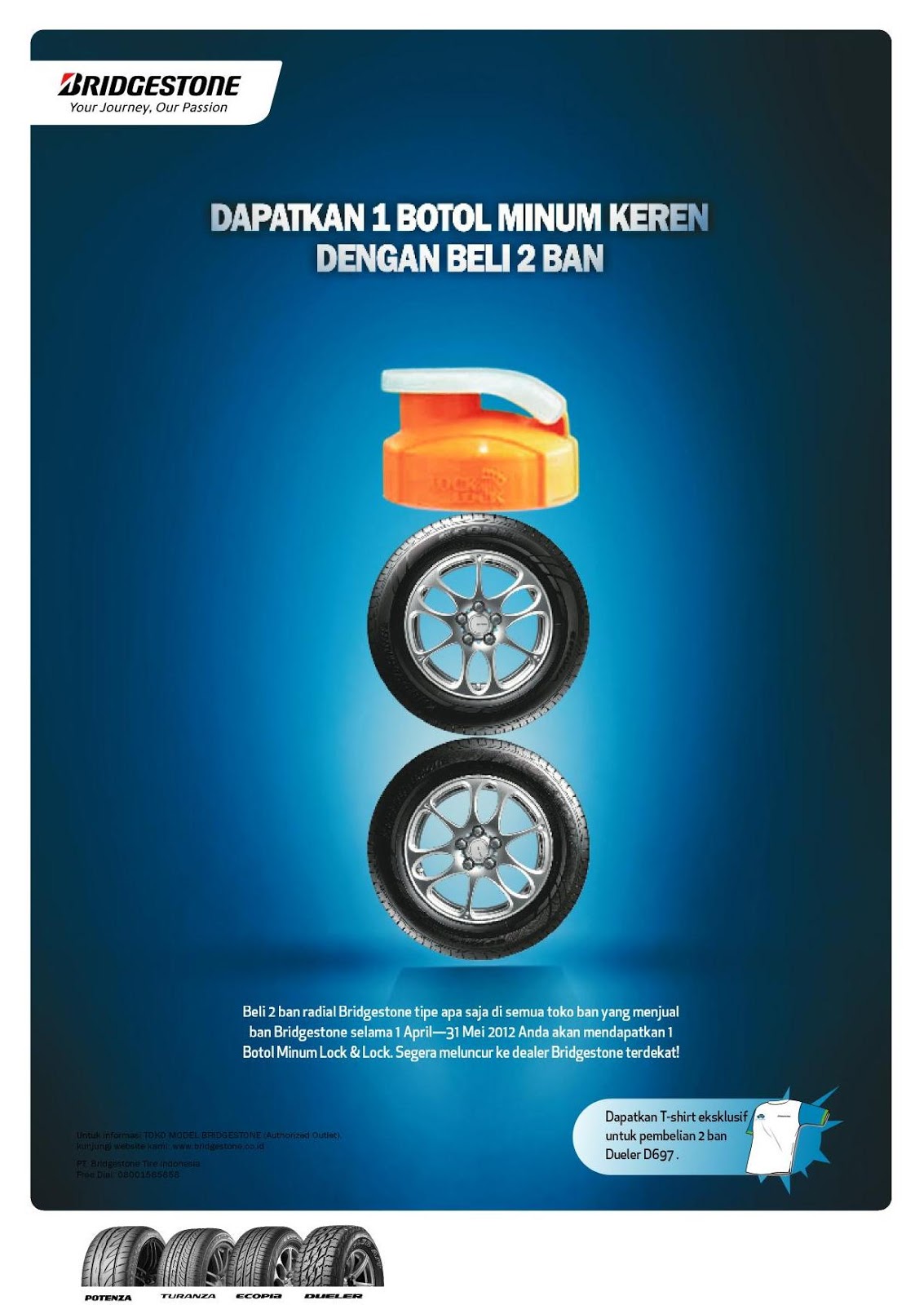

We
know by research that consumers want more than simply a product that marketers
are selling to them. To keep them loyal to a particular brand, a particular
marketer will launch sales promotion programs, either by price deals, loyal
reward programs, sweepstakes or any other deals. To pull more consumers to buy
Bridgestone tires, the Indonesian marketing office of the Japanese tire brand
implemented a loyalty reward program, where consumers will get a Lock &
Lock drink bottle for the purchase of two tires.
PT Bridgstone
Tire Indonesia invited li9ht Brand Communications to work on the print ad and the
store banner that promoted the program. The headline went straight: “Get 1 Cool
Drink Bottle By Buying Two Tires”. But li9ht’s creative team went cutting-edge
and produced a bent visual, where the two tires were shrunk and formed as if
they were the bottle itself with the real cap on top.
CLIENT:
PT Bridgestone Tire Indonesia
PROJECT:
Print Ad and Store Banner
CREATIVE
DIRECTOR: Anto Dwiastoro
COPYWRITER:
Anto Dwiastoro
How to Excavate More Money


Being
a member of Trakindo Group of Companies, PT Chandra Sakti Utama Leasing (CSUL)
provides its customers the convenience and benefit of having all of their
leasing needs under one roof for the purchase of Caterpillar equipment. The company
delivers a one-stop financing for the purchase of Caterpillar tractors,
loaders, engines, generators, excavators and more, for the construction,
mining, forestry, agricultural and energy sectors. Not all prospective
customers of CSUL’s parent company, Trakindo, are aware of this freshen service,
thus li9ht Brand Communications was called in to conceive and design its
marketing kit.
The big
idea was very simple. The Caterpillar equipment that customers buy are sometimes
utilized for the “digging and dredging” of mining materials that were not known
before, so we came up with a single keyword that may represent them all: “unearth”
or “excavate”. By digging into CSUL’s,
Trakindo’s customers may find the best financial solutions ever offered to them,
which eventually will make their businesses more profitable.
CLIENT:
PT Chandra Sakti Utama Leasing
PROJECT:
Corporate Brochure
CREATIVE
DIRECTOR: Anto Dwiastoro
COPYWRITER:
Anto Dwiastoro
Bridgestone’s Chamois Story


There
is nothing too special about a chamois
leather cloth: A type of porous leather that is favored for its gentle,
non-abrasive composition and absorption properties. Car and motorcycle owners
have chamois cloth in their inventory as automotive drying material that is
safe on acrylic, lacquer, enamel, and polyurethane paints and clear-coats. For this
reason, Bridgestone deemed the chamois leather a suitable free gift in exchange
with the purchase of two Bridgestone tires.
For this,
Bridgestone hired li9ht Brand Communications to develop concepts for magazine
and newspaper print ads and store banners that advertised the sales promotional
program. We explored several car owners in Jakarta to find out what they used a
chamois leather cloth for, and whether the cloth is worth to get for two
not-cheap Bridgestone-branded tires. Well, what do you know, other than to
wipe dew or water off their car body, a chamois leather is also used to clean
up the dirt that sticks to car windows! These facts became the creative
rationale of the above designs.
CLIENT:
PT Bridgestone Tire Indonesia
PROJECT:
Print Ad and Store Banner for Sales Promotion Program
CREATIVE
DIRECTOR: Anto Dwiastoro
COPYWRITER:
Anto Dwiastoro
Rabu, 13 Maret 2013
A Colorful Plastic Surgery

What
is more to say about plastic products? Now, here is a plastic product
manufacturing company, based in Sentul, Bogor, West Java that wanted to have an
image finer than its bigger, more popular competitors, while keeping its size
small. PT Arkan Indoplast Utama manufactures plastic packaging and other
products through blowing as well as injection moulds. Well known brands of
shampoos, lubrication, motorcycles, and electronics entrust their packaging and
parts to Arkan, while the company, realizing the waste may damage the
environment, practices the best approach to occupational health, safety, and
environment. There is more to plastics than mere manufacture, so li9ht Brand
Communications saw the need for Arkan to undergo a plastic surgery to produce
an image that has a finer quality.
The identity
development took the form of designing a new logo and improving the looks of
the company profile. The logo moved off from the chemical symbol of plastic
with the color green to signify Arkan’s care for the environment. It bears the
slogan “Beyond Plastics” to affirm the company’s undertaking that goes further
than manufacturing plastic products.
The three-fold
company profile design reveals a colorful display of products, people,
technologies and accents that will be perceived as being a modern and dynamic
company with an eye to the future.
CLIENT:
PT Arkan Indoplast Utama
PROJECT:
Corporate Identity Development
CREATIVE
DIRECTOR: Anto Dwiastoro
COPYWRITER:
Anto Dwiastoro
Taking A Coal Mining Contractor to the Next Level

The
Jakarta-based PT Putra Perkasa Abadi or PPA Coal ventures in the field of coal
mining as a contractor. It summoned li9ht Brand Communications’ assistance in
developing the company’s visual and verbal identities. Environmental issues have
been emerging lately, so we recommended the client to pick it as the central
theme. Coal mining has been blamed for environmental damage, so it will be wise
to brand PPA Coal as a coal mining contractor that cares for the conservation
of the environment. The logo design started off as a stylized form of a coal
(represented by the light to dark grey cube) which is overwhelmed by a bigger light
green cube that represents the green and clean environment. The entire design
connotes that PPA Coal applies a green operation of coal mining.
The kind of typography that we selected for the name of the company gives the impression of being playful so as to make it perceived as a "user-friendly" service company.
The kind of typography that we selected for the name of the company gives the impression of being playful so as to make it perceived as a "user-friendly" service company.
The
slogan at the bottom literally signifies that
customers will be taken into deeper levels of the soil, where the best quality
coals are usually found, and it is also an idiom which means “to improve”. In
other words, PPA Coal improves the way coal mining is done and it will improve a
customer’s coal trade.
CLIENT:
PT Putra Perkasa Abadi
PROJECT:
Visual and Verbal Identity Development
CREATIVE
DIRECTOR: Anto Dwiastoro
COPYWRITER:
Anto Dwiastoro
Selasa, 12 Maret 2013
The Intellectual and Spiritual Wisdom’s Need for Branding


Folder (Outside)

Folder (Inside)

Flap
The Sumohadiwidjojo
Center was founded in December 24, 2011 in Jakarta to promote the study of intellectual
and spiritual wisdom for the wellbeing of man and the world. The center
submitted a request to li9ht Brand Communications to develop its visual
identity and its application on numerous promotional items that were used in a
seminar on the subject on June 9, 2012. The logo design started out from the
Center’s name initials, i.e. SC. The body of the “S” is shaped by the stylized
form of a quill, and the “C” finds itself inside the “S”, which symbolizes that
it is the core of the Center’s activity—a study center. The color blue stands
for “peace” and “spirituality”, grey for neutrality and yellow being the color
of the mind and the intellect.
CLIENT:
Sumohadiwidjojo Center
PROJECT:
Identity Development
CREATIVE
DIRECTOR: Anto Dwiastoro
Langganan:
Postingan (Atom)